Peter Voulkos
Cherubini
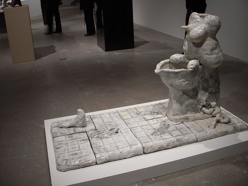
Sculpture
1957
Glazed Stoneware, 35 x 21 x 21 inches
Peter Voulkos is a master of handling clay. In the 1950's, Voulkos was the leader of the post-war American ceramics movement, "Revolution in Clay." His abstract and expressionistic style in clay sets him apart from various other ceramic sculptors (Brumer, artscenecal.com). In one of his pieces, which is being shown in the Dirt on Delight exhibit in the Walker Art Center, Cherubini, or also just known as "Sculpture" shows off Voulkos skill. The largest forms in that compromise the structure of the statue are three large spheres placed one on top of the other. They are placed, to where it gives a hint of a three balled snowman. On the top of the statue is a spiked, narrow, tall strip. Giving the snowman a look like it has a mohawk. On the sides of the top sphere are these twisting spiked extentions. They twist and turn out of the side of the sphere, just on what would be the flat part of the mohawk, twisting and turning like a spiked horn on the left side of the statue. There is another spiked horn coming out toward the back of the top sphere on the snowman. In what appears to be the front on the top ball, is a hole. That hole is like if you were in the tundra surrounded by cold snow and everywhere you look you see whiteness except for these two caves. These two caves whose entrance is as black as the snow is white. Underneath the top empty hole, where the top two spheres merge together, there is a bended spiked band. It curves into an arc, like a big droopy mustache, with spikes. Right below that, is another empty hole, like a belly button. Coming right out of the belly button, is the same design as the droopy mustache. It comes out going all the way to the floor like ribbon cascading down to the floor. On the sides of the middle ball are these flat slabs, much like the ribbon looking slab. The ones on the side travel up to the top sphere like arms touching the side of what would be the head. On the very bottom sphere are these spikes that jut out of the snowman like it has a jester's hat on the bottom of it, instead of on the top by the "head".
My interpretation of this piece is that life is never how you expect it. No matter how much you try to make sense of what is going on, something will always through you in a loop. You just have to keep journeying to different locations and see what else life can offer you.
Looking at this statue by an instrumental point of view, and from my interpretation of it. I would think that it has a purpose; that it makes the viewer think. It makes the viewer think about what is going on. However, it doesn't make the viewer think about the problems that are happening in the world, or anything of the like. It just makes the viewer think about what this piece is all about. Makes the viewer try to make sense on what this piece represents, why it was created. So I believe, instrumental wise, it is a failure. I do however, feel that this piece is a success formalistically wise however, because it seems to have a really strong sense of "art for art's sake." It has potential aesthetic appeal; however, I dislike this work of art. I personally don't find it aesthetically appealing.
Brumer, Andy.
http://artscenecal.com/ArticlesFile/Archive/Articles1999/Articles1299/PVoulkosB.html
10/29/2009.